Designing Santander’s Change
of Address Self-Service
Role: Lead UI Designer - Customer Info Squad | Stakeholders: Product managers, UX researchers
Method: Agile, ToL | Principles: User-centered Design, Service Design| Tools: Figma
Get the App
Overview
As Lead UI Designer within Santander’s Customer Info squad, I led the end-to-end design of the Change of Address feature — enabling customers to easily update their residential address within the mobile app. This was a high-visibility project that I took from discovery through to delivery, working closely with product managers, UX researchers and the development team to ensure the experience was secure, compliant, and user-friendly.
The goal was to modernise what had traditionally been a manual or branch-based process, while aligning with Santander’s broader push to digitise core account management journeys.
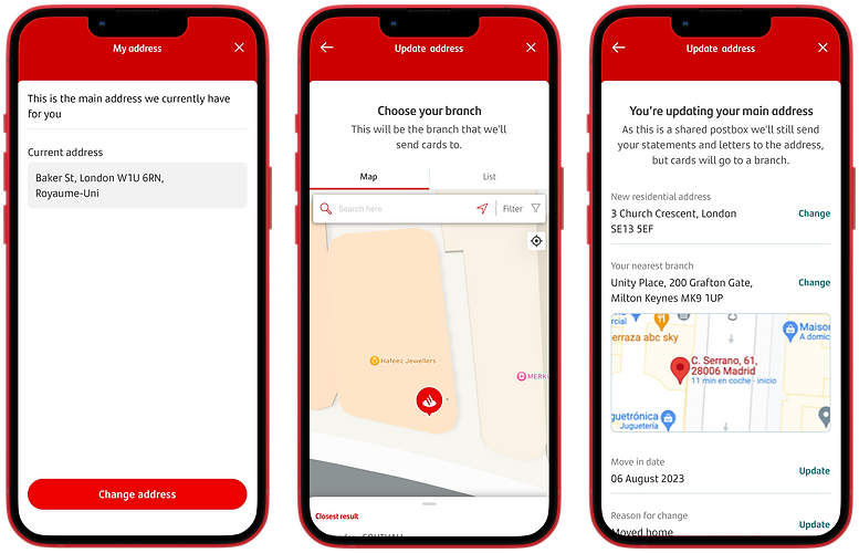
Change of Address - Self Service
The Change of Address feature was designed to let Santander customers update their residential address directly through One App, removing the need to call support or visit a branch. This functionality was part of a broader strategy to enhance self-serve capabilities within the mobile experience. From a business perspective, the goal was to:
✅ Enable customers to self-serve this common request
📉 Reduce call centre volumes
🏦 Lower branch traffic for basic account maintenance tasks
.png)
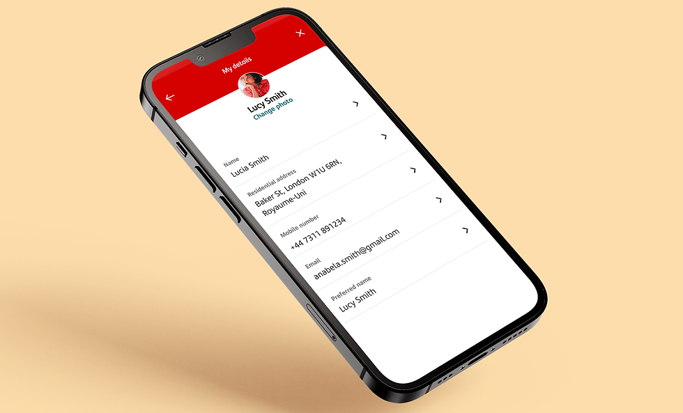
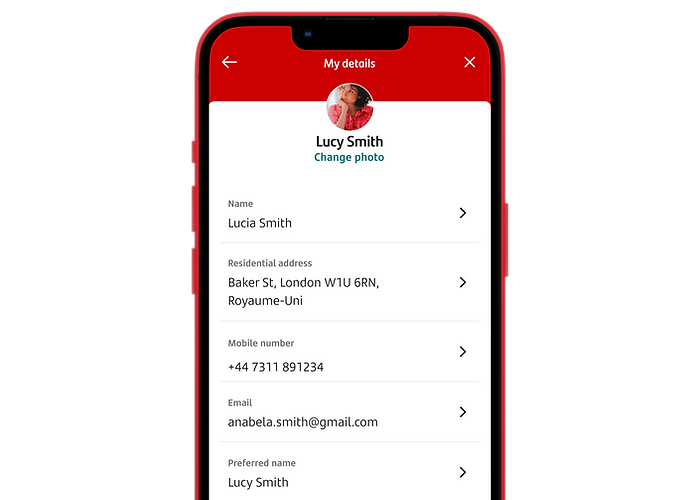
'My Details'
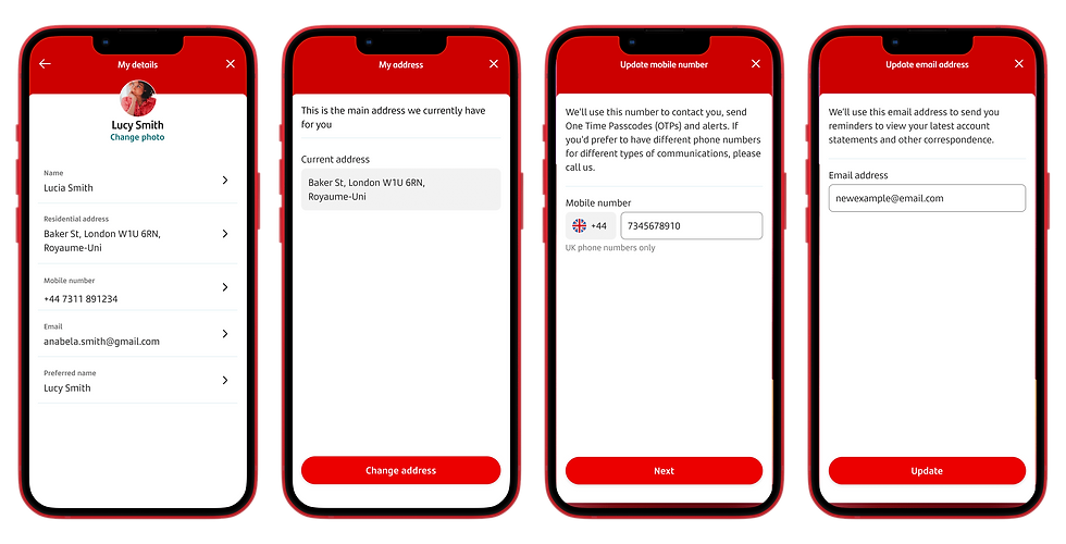
I owned the end-to-end design of the ‘My Details’ section of One App and Change of Address feature was a part of that, alongside other editable information like mobile number and email address. This placement aligned with user expectations and supported a consistent, intuitive structure across Santander’s self-serve account management journeys that I was working on.
.png)
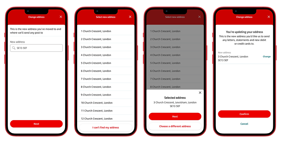
Ensuring Reliable Address Search
A key component of the journey was the postcode lookup tool, which allowed users to search and select from a complete list of UK addresses based on their postcode. This tool, provided by a third-party vendor, was critical to the success of the flow — if the lookup failed, users would be diverted to call support, undermining the self-serve objective. We worked closely with Santander’s development team to rigorously test the tool across a wide range of scenarios to ensure accuracy, coverage, and reliability before release.
.png)
Branch Locator for Secure Delivery Options
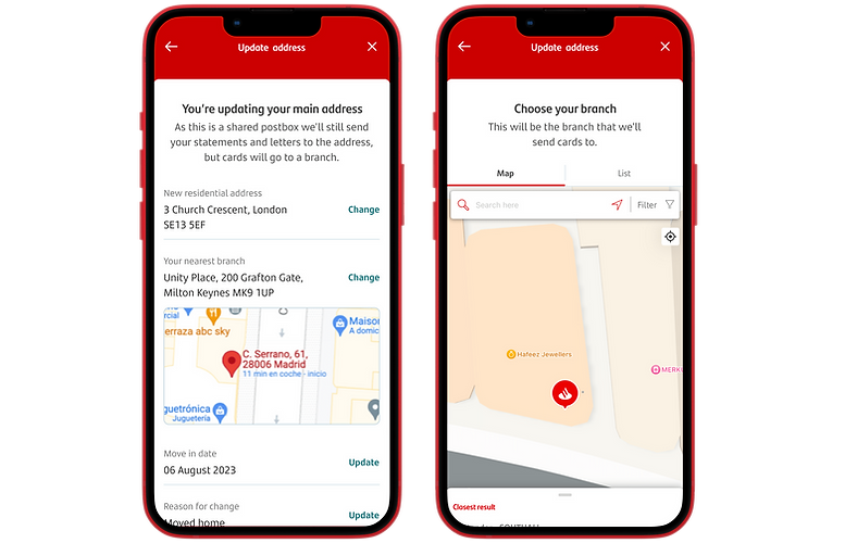
As part of the flow, we integrated a Branch Locator tool to support cases where users preferred not to receive mail at their home address — for example, due to shared mailboxes or security concerns. In these scenarios, users had the option to redirect cards to a local Santander branch.
I embedded the tool seamlessly into the UI, offering two views: a postcode-based list, with the nearest branch shown first, and an interactive map displaying branches within a 5-mile radius. This allowed users to select their preferred branch quickly and confidently, maintaining both convenience and privacy.
.png)
Change of Address User Testing
Background: We are looking to introduce the ability for customers to be able to self serve a change of address
request through One App
Objective: To ensure users are able to self serve a change of address request sufficiently.
Gather insights to evaluate whether there are any potential blockers stopping users from being
able to complete the journey.
Method: Remote unmoderated advanced UX study with 15 participants to complete a specific task within
a prototype via Userzoom
Research Approach
Remote unmoderated advanced UX study with 15 participants to complete a specific task within a prototype via Userzoom
We wanted to understand the following:
Navigation: Were users able to locate the entry point to ‘My details’ sufficiently
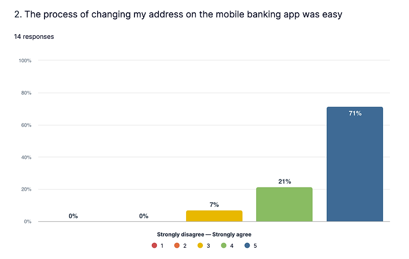
Ease of Use: How easy was the process of ‘changing address’
Performance: How efficient the process of ‘changing address’ is, measured by length of time it took to complete the task and average number of clicks
Insights: Gather insights from users to see if anything can be improved
.png)
Study Structure
The study was broken down into 3 main parts:
Background questionnaire:
We asked participants background questions to gather their current behaviours regarding how they manage their account through their banking provider.
Navigation task:
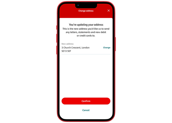
Changing address: We asked participants to navigate through the app and update their address to ‘3 church crescent’.
Navigation questionnaire:
We asked participants that were able to complete the task successfully how they found the process. These included quantitative and qualitative questions.
Summary
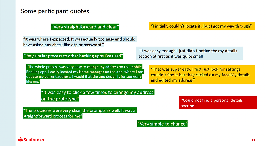
✅ Overall the majority of the feedback was generally positive.
✅ The user journey was inline with the UK market and what customers expect to see.
✅ The user journey was ‘easy’, ’straightforward’ and ‘clear’
🚨 Navigation: it became evident that some users did not notice the ‘my details’ entry point. Around 4 users tried to tap
‘My Home Manager’ while 2 tapped ‘Important information’ Some users also tapped ‘Settings’ where the entry point was previously
🚨 A single participant was not able to complete the journey because they could not successfully navigate to ‘My details
ToL (Think out Loud) Participant Quotes
Findings & Recommendations
From the first round of user testing, around 3 out of 30 users (10%) was not able to locate and navigate to My details to update their address.
These users were tapping the “More options” shortcut from GP, assuming entry points to “My details” were located there. Other users did not assume that “My details” was located under ‘Settings” within the side menu.
As Lead UI designer, it was my responsibility to come up with solutions to improve the find-ability of My details, even if the navigation issues sat outside my squad.
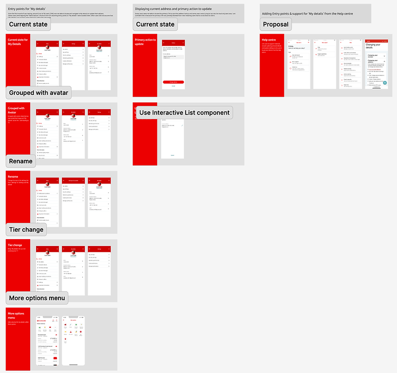
Uncovering Navigation issues in the UK + 3 Other EU Territories
Around 10% of users could not navigate to My Details to complete the task, this uncovered issues that affected users not only in the UK but also Spain, Portugal and Poland. Because some screens were shared across all territories (highlighted in red) and some were just for UK users (highlighted in blue). So any changes had to get signed-off through 4 countries.
IA and Navigation Audit
I audited the current live IA of the main navigation menu, combing my findings with data collected from the ToL Click Test.
Prompting action
I then presented my this to the design squads and product managers responsible for the navigation within each region. Which then prompted each region to start their own investigations. I then provided 'quick fix' solutions for the UK, highlighted below.
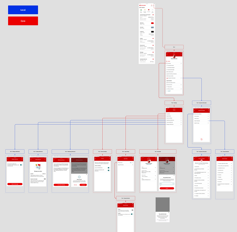
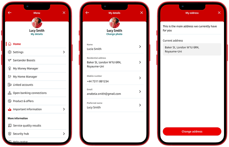
Recommendation: Grouped with avatar
Grouped with avatar where the tap area is both the image and “My details” action link - both leading to Tier 3
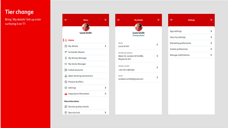
Recommendation: Tier Change
Bring ‘My details’ link up a tier surfacing it on T1 within the main navigation menu.
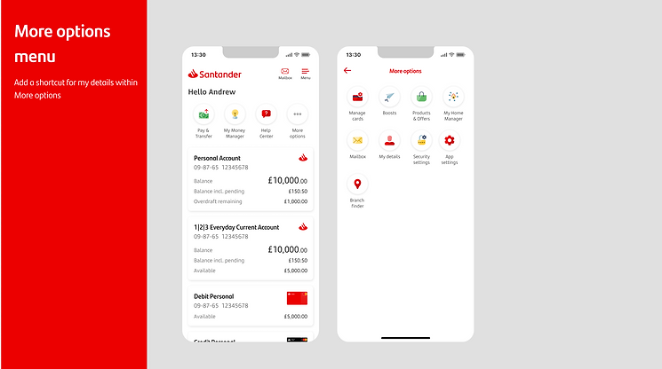
Recommendation: More Options Menu
Add a shortcut for My details within the More options menu
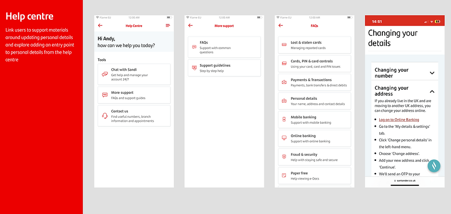
Recommendation: Help Centre
Link users to support materials around updating personal details and explore adding an entry point to personal details from the help centre.
Day 1 MVP Constraints
While the journey was designed to be simple and unified for the customer, the Day 1 MVP was shaped by limitations within Santander’s legacy tech stack. One of the core challenges was that back-end systems for different products did not fully communicate with one another.
As a result, if a user held multiple products — such as a savings account and a mortgage — their address would need to be updated separately for each, as the data was stored in isolated systems.
This fragmentation meant that, while the UI offered a streamlined experience, the initial release required careful messaging and fallback logic to prevent confusion or customer service friction.
.png)
Mitigating Gaps with a Chatbot Handoff
Due to limitations in Santander’s back-end systems, users could only update addresses in-app for certain products, like savings accounts. For others, such as mortgages, we introduced a chatbot handoff at the end of the journey to continue the process. This not only maintained a smooth user experience but also ensured compliance with regulatory requirements, avoiding any gaps in address accuracy across products.
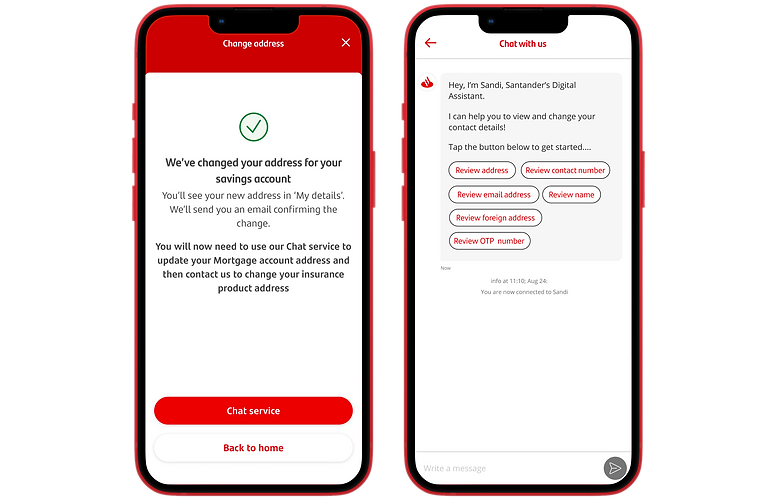
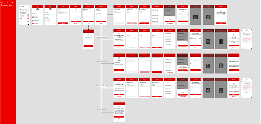
MVP Day 1 User Flows – Overview
The user flow diagram maps the end-to-end address change journey within the authenticated app environment. It includes conditional logic for product eligibility, postcode lookup integration, and dynamic routing based on account types. Fallback paths trigger chatbot escalation for restricted products, while scanning and confirmation screens support identity verification where required. The flows are modular, API-driven, and aligned with back-end service availability for a Day 1 MVP rollout.
Day 2 Ideal User Flow
The Day 2 design illustrates a fully integrated address change journey powered by unified back-end services. Unlike the Day 1 MVP, this flow enables users to submit their new address once, with updates automatically propagated across all linked products and accounts.
The improved architecture eliminates user-facing complexity, removing the need for product-level selection or manual rerouting.

Accessibility
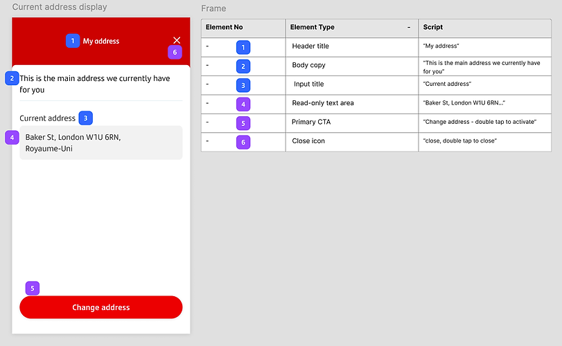
I designed with assistive technologies in mind from the start, ensuring compatibility with screen readers like VoiceOver and TalkBack. All components were scripted with clear, descriptive labels to support smooth navigation using gestures or keyboard controls.
The annotated screen shows how elements like buttons and headers were defined to ensure correct reading order and actionable feedback. I worked closely with dev and QA to test implementation on real devices.
Handoff & Production Support
Once the designs were signed off, I owned the handoff process to ensure a smooth transition into development. This involved preparing detailed design specs in Figma, including interaction notes, accessibility scripts, and responsive behaviour across devices. I collaborated closely with developers to walk through each flow, clarify edge cases, and ensure alignment with both UX intent and technical feasibility.
As production progressed, I remained actively involved — answering implementation questions, and raising any visual or functional discrepancies during QA. I also joined regular design/dev syncs to unblock issues quickly. My role didn’t end at delivery; I supported the product through to release, helping to uphold design quality and maintain consistency across the experience.
